This Way to the Beach

This Way to the Beach

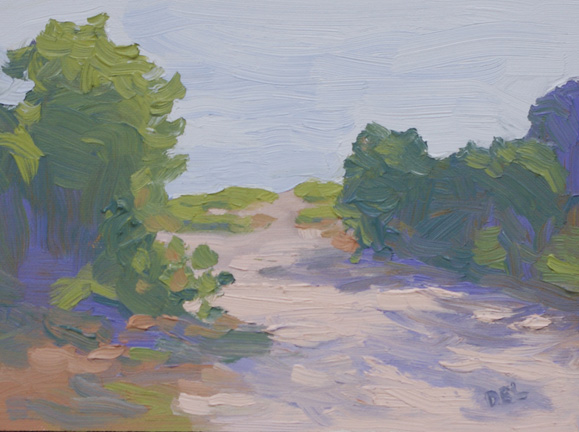
This Way to the Beach – 6×8 oil on panel

Using very visible brush marks and staying away from detail – Done!

Yesterday I was very non-communicative, keeping everything inside as usual.  My apologies – especially to myself! Here’s what I meant to say:

This path to the beach is on Jupiter Island, FL and really does have the perfect “S” shaped path that is a must component for a perfect composition.

(Read Edgar Paynes book: “Composition of Outdoor Painting” for other great compositional tips.)

The “S” shape leads you into the painting and makes your eye wander around.  In this case it wasn’t something I made up – I found it there while driving down the road to the beach on the north end of the island.  It’s private property so I couldn’t just pull over and paint.  But, I usually just snap a picture so that I can paint it later when presented with a situation like that.  Actually I also will take many pictures for later reference even if I’m on location painting.

Painting from photographs is a challenge because the camera doesn’t duplicate what we see with our eyes.  However, there are two things that are good about photographs – one you can take your time with the painting because the light won’t be changing and second you can view the picture on your computer screen and it’s a fairly good replication of outdoor light.  The one thing I modified immediately was to not include the “for sale” sign in front of the bushes.  Next I decided that in order to compensate for the unruly shadows produced by the camera I would paint in a lighter range, something I’m working on in general.

Chorus Line

Chorus Line
Chorus Line, 8x10 Oil on Panel

The practice of setting up a small still life and limiting the time you spend on it has been around for a long time and it’s a practice that I enjoy.  Some of the most inspiring subjects are in the produce department and I find myself there testing the bartlet pears quite often.  Most people might be looking for softness, ripeness, but my tests are: can the pear can stand on it’s own, is it a shapely pear, and of course, how good is the color?

Once they’re home with me, I set them up with dramatic lighting, as if they are on stage!  With this painting my goals were to improve my brush work and to keep the colors light and appealing.

Using a bristle flat brush is greatly improving my brush work since it holds more paint and the marks are showing how luscious the paint is.  The pears were juicy and luscious, so they should be depicted that way.  My palette is a simple rainbow palette that I’ve been using for years but I’ve lightened things up now, reminding myself to stay in the higher value range.

The Soloist - 5x7 oil on panel

This guy needed his portrait painted and didn’t have anything to do with that other group.

Thanks to the sale a Jay Mar, I’m stocked up on canvas now and will be painting more still lifes in the near future.

My collection of thrift store finds will be a future series of paintings and great composition practice.

Feel free to give me feedback or ask any questions in the comments section and thanks for looking!


Hiatus in Hobe Sound

Since I’ve been in the process of regrouping and trying to get back to normal, what ever that is, I’ve taken the opportunity, as I usually do, to study and improve my technique. This usually applies to my brushwork and color mixing in oils. Not that I don’t work on my pastel technique also, but there seems to be less need for improvement and I usually approach pastels with a more adventurous attitude and will experiment more, possibly using new products. With oil I’ve gotten in the habit of using the painting knife too much and sort of lost touch with my brush work. Therefor I’ve been restricting the use of the knife to color mixing only!

The best way to study, for me anyway, is to do small still lifes and small landscape studies. My plan is to begin posting these and try not to get too hung up on how finished they look.

Since I haven’t photographed any of these paintings yet, but will soon, I’ll just put up something here that inspires me.

White City Water Lilies

This was painted on location in White City, FL.

A bit of news that I can share is that I’ve been juried in to the Women Painters of the Southeast recently and look forward to participating in that group in the future. Go check them out, I’m in great company.

http://www.womenpaintersse.blogspot.com/

Harry and the Natives, Hobe Sound, FL

A few years ago I did a special project that I called “The Hobe Sound Project” where I left post cards around town and asked everyone to tell me what they wanted me to paint and in the spring there would be a show of all the paintings. This particular painting is one of my favorites from that project. It’s a pastel on La Carte pastel paper. This paper has a lot of tooth to it and it has a luscious look to it when you fill the tooth, probably from the coating, which they say is vegetable matter, and I think some cork. You can’t use liquids on it though because it will just fall apart.

Harry and the Natives is located on the main intersection of Hobe Sound at Route 1 and Bridge Road and serves local delicacies, such as gator burgers. The street light is from the old part of Hobe Sound and there isn’t actually a glass globe on it but I thought it needed one.

Harry and the Natives

Hobe Sound Beach Umbrellas Study

Sometimes I do a small study in watercolor crayon and marker pen before the larger painting. This is only 6×8 on “Fluid” Watercolor paper 140 lb., which comes in a block of 15 sheets. The watercolor crayons are made by Caran D’Ache and mine is a set of 40 and the pens are Faber Castell with the brush tip.

Postcard From Paradise sketch
Hobe Sound Beach Umbrellas sketch

The great thing for me is that the watercolor crayons are similar to pastels and I just love the way you can scribble with them, then wet them down and scribble some more.


Hobe Sound Beach Umbrellas

The actual title of this painting is “Postcard from Paradise” but it’s the usual spot at Hobe Sound Beach.  This was done from a photograph that I had taken, actually I had taken many photographs that day because while I was there painting another painting more umbrellas kept popping up.  I wanted to be sure that I had the maximum number of umbrellas and this is what I ended up with.  The beach drops off and people set themselves up on the edge of the dune.

This is a pastel painting on Wallis Museum Grade paper.  It’s a decent size – 18×24 and I started with a water color underpainting.  The underpainting is mostly a block in of complementary colors. So, in the grassy foreground I used a reddish brown and pink for the sky and water.  An underpainting also saves on pastels, because the Wallis paper is a sanded paper that will eat up the pastels fairly quickly.

Postcard From Paradise
Pastel Painting - 18x24


Hobe Sound Beach revisited!

It seems like I go to the beach a lot  – but actually I don’t go nearly enough.

My favorite thing to do is paint on location and the Hobe Sound Beach is very condusive to that.  Everyone is using the fancy french term now – “plein air”, which is painting on location.  My main criteria for selecting a place to paint is some kind of a view (obviously), accessibility (easy access is important when you are hauling art supplies), and restrooms (if I plan on being there awhile).  Most of the time I’m not at a location more than a few hours, depending on the size of the painting.

The Hobe Sound Beach is a great place to paint because there is a covered pavillion with a number of picnic tables and there is a convenient rest room right next to it.  Here in Florida the shade is very important and even with the shade I still wear a hat in case I set up in a spot where the sun moves in later on.

If I decide to paint with oil paint then I usually use painting knives.  The knives are fun and easy to paint with, not to mention the wonderful impasto effect.  My preference is to use canvas panels that are made by Pintura – they are wood with canvas on the surface.  Stretched canvas has too much give to use with a knife.  Most people paint small when they paint on location, like maybe 6×8.  When I first started I used 8×10 or 11×14 and this painting is a whopping 16×20.  Painted on a very windy day – I had to hang on to it the whole time, which was only a couple of hours.

Ocean View No. 5
Ocean View No. 5 - Oil on panel - plein air knife painting - 16x20

Hobe Sound Beach continued………..

It occurred to me this morning that I have more to show from Hobe Sound Beach and don’t know why my post was so short yesterday. My plan isn’t to blog daily because then I wouldn’t get any painting done, but will post frequently to start anyway.


End of Hobe Sound Beach
Oil - knife painting - 5x7


This is a full shot of the painting that I use on my header and avatar.  If you walk down to the end of Hobe Sound Beach this is what you see.  Because it’s such a hike I painted this from a photo instead of hauling my art supplies out there.


I’ve also painted this view in pastels and it usually is hanging up at JayMar in Stuart, FL where I sometimes teach pastels.


Beach End
Pastels on Canson


Here is the larger version of the lifeguard station that I painted on location:


Hobe Sound Life Guard Station
Oil on panel - plein air knife painting - 12x16

Hobe Sound Beach

Caution Flag
Caution Flag - Oil - 5x7


This is one of my small works – in fact I’ve painted this in a larger format as well.  The lifeguard station is actually not the coolest type of lifeguard station in FL.  It’s one of those metal things that seem to be portable.  I’d prefer a nice old wooden structure with more character like the ones down in South Beach.