Riverbend

Riverbend
Riverbend - 8x10 Oil on Panel - Plein Air

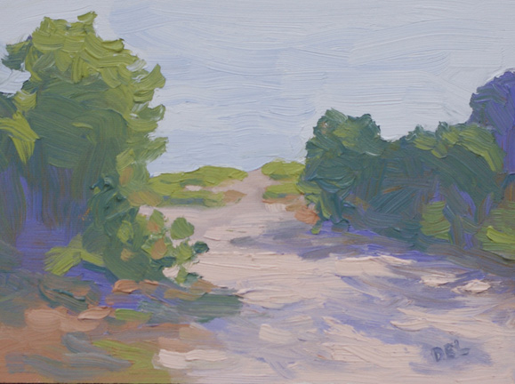
Last week I painted this at Riverbend Park in Jupiter, FL.  It was the first time there for me and I was surprised at how big the park actually is.  There were many scenic views to choose from but since my pan head connection (the little foot that connects my palette to the tripod) was nowhere to be found, I had to make use of one of the picnic tables that had the added convenience of a chickee roof.  (The things that are made out of palm fronds.)

When I first arrived there was a man fishing on the river bank and he had all his gear on what I considered prime real estate – the picnic table with the view.  When I asked if we could share the table he was more than happy to accommodate, so problem solved.

However, not long after getting set up and ready to paint there were several more people that joined the painting group I was there with.  They saw me and thought that was the place to be, so we literally moved him completely out.  At first I felt bad, but he seemed to be enjoying the comradery and really, fishing/plein air painting, same thing.

The only down side was that two of the ladies set up in  front of me, sort of obstructing my view, but you win some and you lose some.  In the end, I won this little painting and I managed to get home before it rained!:)

The same path

So, after I posted and edited and updated “This Way to the Beach” I was thinking about it and it seemed like something that would be a fun monotype print.  Apparently, that thought ran across my mind before because here it is – done already:

This Way to the Beach Again

In fact, it’s posted on my original WordPress blog, that I haven’t been using because it didn’t link me to my location.

That blog is found at: http://useallthecrayons.wordpress.com/ and oddly enough, my last post was on monotypes, this one included.   Hope you don’t mind the resurrection.

Please let me know if there is  too much redundancy because obviously it doesn’t occur to me.  Sometimes I’ll draw or paint the same thing until it’s right or because it’s a pleasant composition.  Don’t you think it’s interesting to see how the same subject looks with different mediums?

This Way to the Beach

This Way to the Beach

This Way to the Beach – 6×8 oil on panel

Using very visible brush marks and staying away from detail – Done!

Yesterday I was very non-communicative, keeping everything inside as usual.  My apologies – especially to myself! Here’s what I meant to say:

This path to the beach is on Jupiter Island, FL and really does have the perfect “S” shaped path that is a must component for a perfect composition.

(Read Edgar Paynes book: “Composition of Outdoor Painting” for other great compositional tips.)

The “S” shape leads you into the painting and makes your eye wander around.  In this case it wasn’t something I made up – I found it there while driving down the road to the beach on the north end of the island.  It’s private property so I couldn’t just pull over and paint.  But, I usually just snap a picture so that I can paint it later when presented with a situation like that.  Actually I also will take many pictures for later reference even if I’m on location painting.

Painting from photographs is a challenge because the camera doesn’t duplicate what we see with our eyes.  However, there are two things that are good about photographs – one you can take your time with the painting because the light won’t be changing and second you can view the picture on your computer screen and it’s a fairly good replication of outdoor light.  The one thing I modified immediately was to not include the “for sale” sign in front of the bushes.  Next I decided that in order to compensate for the unruly shadows produced by the camera I would paint in a lighter range, something I’m working on in general.

Chorus Line

Chorus Line
Chorus Line, 8x10 Oil on Panel

The practice of setting up a small still life and limiting the time you spend on it has been around for a long time and it’s a practice that I enjoy.  Some of the most inspiring subjects are in the produce department and I find myself there testing the bartlet pears quite often.  Most people might be looking for softness, ripeness, but my tests are: can the pear can stand on it’s own, is it a shapely pear, and of course, how good is the color?

Once they’re home with me, I set them up with dramatic lighting, as if they are on stage!  With this painting my goals were to improve my brush work and to keep the colors light and appealing.

Using a bristle flat brush is greatly improving my brush work since it holds more paint and the marks are showing how luscious the paint is.  The pears were juicy and luscious, so they should be depicted that way.  My palette is a simple rainbow palette that I’ve been using for years but I’ve lightened things up now, reminding myself to stay in the higher value range.

The Soloist - 5x7 oil on panel

This guy needed his portrait painted and didn’t have anything to do with that other group.

Thanks to the sale a Jay Mar, I’m stocked up on canvas now and will be painting more still lifes in the near future.

My collection of thrift store finds will be a future series of paintings and great composition practice.

Feel free to give me feedback or ask any questions in the comments section and thanks for looking!


Framing Tips for Artists

This is from my custom framing website and thought some might find something useful in this list of tips.

A well framed work of art reflects on the artist’s professionalism.

Use archival acid free framing materials to better preserve your piece of art.

Mats should be ragboard, 100% cotton rag.  The color selection is much wider than it used to be.

If you are framing to sell, consider using the most elegant selections possible that would fit in with any décor.  This not only increases the chance of a sale but really showcases your artwork. It’s great when the buyer’s first thought is not one of what to do about the frame but one of admiration of the total package.

If you are framing for a juried show then choose the most conservative route.  Neutral color mats with plain frames. Your work will fit in anywhere!

No matter what choices you make be sure to make a solid presentation with the best archival material you can afford.

Matting Guide:

How you mat your work can add to or detract from your piece of art.

An undersized border will make your work looked cramped.  Here are some good guidelines for mat border sizing:

    Up to 11×14 use a 2.5” border
    Up to 16×20 use a 3” border
    Up to 24×28 use a 4” border
    Larger than 32×40 use a 6” or larger border

The next thing to address is deciding on the border weighting.  A really great look for small work is to use an oversize border, which makes the work stand out more and look important.

In general,  if the artwork itself has an evenly weighted composition then the borders too should be evenly weighted.

Increasing the bottom border by no more than 1” will lift the art visually

If the work is vertical and tall, adding weight at the bottom is effective.

Wide side borders look well with a long, narrow, horizontal image.


REMEMBER – IF YOU WANT TO LEAVE YOUR MARK ON THE WORLD – MAKE IT A GREAT MARK!!!

Hiatus in Hobe Sound

Since I’ve been in the process of regrouping and trying to get back to normal, what ever that is, I’ve taken the opportunity, as I usually do, to study and improve my technique. This usually applies to my brushwork and color mixing in oils. Not that I don’t work on my pastel technique also, but there seems to be less need for improvement and I usually approach pastels with a more adventurous attitude and will experiment more, possibly using new products. With oil I’ve gotten in the habit of using the painting knife too much and sort of lost touch with my brush work. Therefor I’ve been restricting the use of the knife to color mixing only!

The best way to study, for me anyway, is to do small still lifes and small landscape studies. My plan is to begin posting these and try not to get too hung up on how finished they look.

Since I haven’t photographed any of these paintings yet, but will soon, I’ll just put up something here that inspires me.

White City Water Lilies

This was painted on location in White City, FL.

A bit of news that I can share is that I’ve been juried in to the Women Painters of the Southeast recently and look forward to participating in that group in the future. Go check them out, I’m in great company.

http://www.womenpaintersse.blogspot.com/