The Red Bridge on Jupiter Island

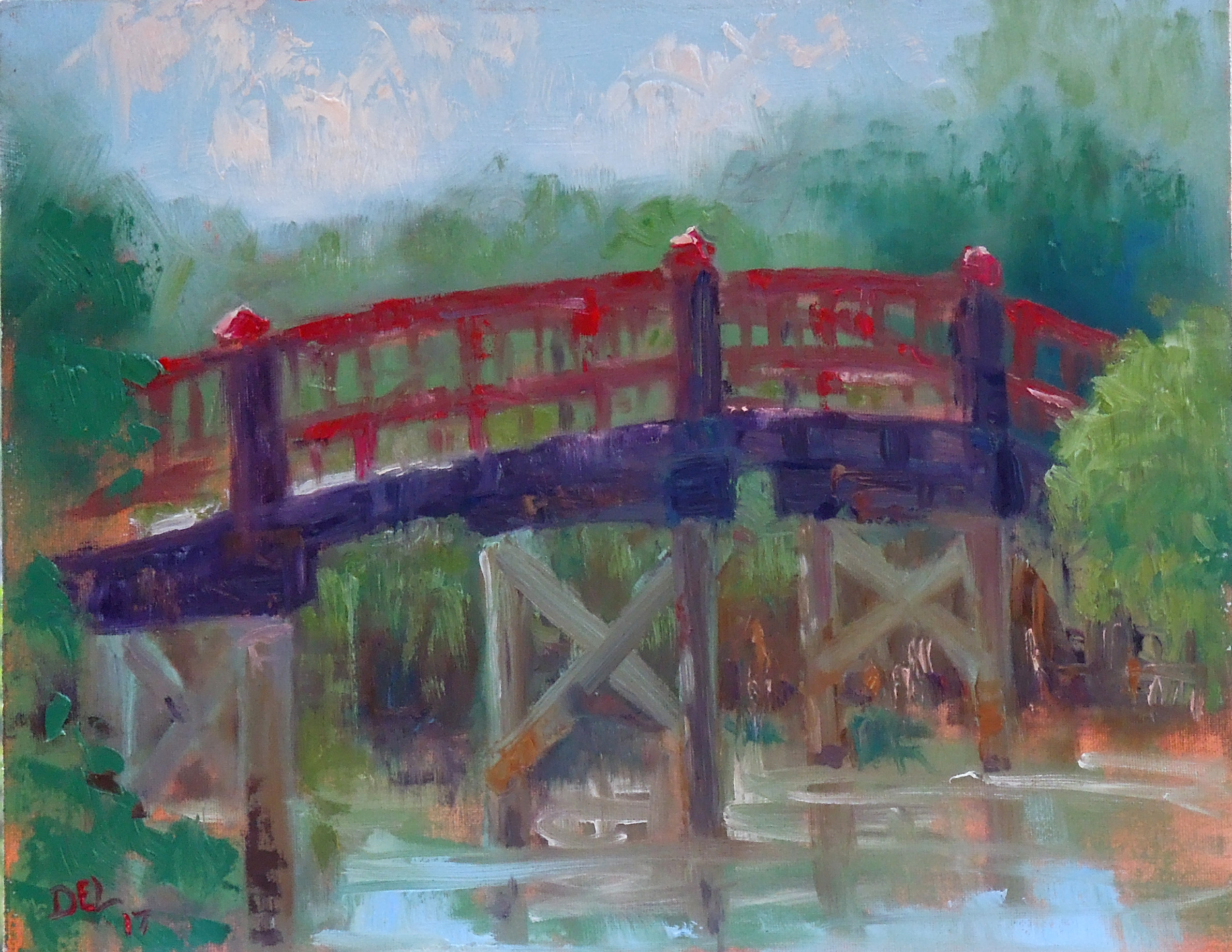
In the not too distant past, on a Tuesday of course, just before Christmas in fact, a friend and I decided we should go paint the red bridge on Jupiter Island. It was a beautiful day  and there were plenty of people passing by. The bridge is located at the end of a bike path and connects the island to another smaller island called Harbor Island, that the local garden club maintains. My inclination is always to paint the bridge even though there are plenty of options over on Harbor Island.  The only disappointment was that since the last time I was there, they painted the bridge a duller red than the true red it was for years. I’m hoping that they go back to the old color soon. It’s just not as brilliant as it once was. In spite of that though, my painting was sold before it dried.

Happiness Bridge - oil on board - 11x14 - sold
Happiness Bridge – oil on board – 11×14 – sold

Plein Air Tuesdays

Here is a   plein air  painting recently done on a Tuesday, of course.

St. Christopher's - 10x8 oil on panel
St. Christopher’s – 10×8 oil on panel

This church is at the center of Hobe Sound, FL and is different on every side. So, I need to go back 3 more times at least to paint the whole church. It was a clear beautiful day and I was happy with this small charming painting.

Tuesday Paintings House of Refuge Beach

Last Tuesday, not yesterday but Tuesday of last week, we painted at the House of Refuge on Hutchinson Island, a narrow strip of land called Gilbert’s Bar. It was a nice breezy day and I decided to paint the beach instead of the buildings. The limestone rocks alone are an interesting subject. Even though I had time for a second small painting I still painted the rocks and ocean instead of the buildings. So here are mama and baby paintings from last Tuesday.

House of Refuge Beach - 11x14 oil on panel
House of Refuge Beach – 11×14 oil on panel
Mini House of Refuge Beach - 5x7 - oil on panel
Mini House of Refuge Beach – 5×7 – oil on panel

Met some friendly beach walkers and one dog that was mostly interested in digging to China.


Pastel Demo and more Tuesday Paintings

Recently I was asked to do a demonstration of my method of painting with watercolor and pastels at a local art club. It was a fun morning and well received. Here is the painting I did for them that I started with a watercolor underpainting.

Savannah - 12x16 - pastels
Savannah – 12×16 – pastels

and here are more plein air Tuesday paintings:

11 Maple St. - 9x12 - pastels
11 Maple St. – 12×9 – pastels


Port Salerno - 9x12 - pastels
Port Salerno – 9×12 – pastels


Lyric Theater Building - 9x12 -oil
Lyric Theater Building – 9×12 -oil


Sewells Point Morning - 9x12 - oil
Sewells Point Morning – 9×12 – oil


Ancient Oak - 8x10 - oil
Ancient Oak – 8×10 – oil


Palms at Indian Riverside Park - 12x12 - oil
Palms at Indian Riverside Park – 12×12 – oil

Publicity!

It’s rare to get free publicity, at least for me it is, but one of my paintings will be in the next issue, July/August, of Fine Art Connoisseur magazine. (not on newsstands yet) http://www.fineartconnoisseur.com/

The magazine is one of those well done, high quality, shiny art magazines that is aimed at collectors.

My painting is part of a photo essay on painting in parks, which is something I love to do.  One of my favorite parks is a local one, Jonathan Dickinson State Park and the painting is one of several I’ve done of the Loxahatchee River. You’ve seen it here before, but here it is again:

Banks of Loxahatchee - 9x12 - Pastel on sanded paper
Banks of Loxahatchee – 9×12 – Pastel on sanded paper

You can see other paintings that are part of the Painting the Parks program on the Fine Art Gallery page.

Also here is the link to the website for Painting the Parks, so that you can see other park paintings.   http://painttheparks.com/

Seabreeze

Seabreeze - Oil on Canvas - 20x24
Seabreeze – Oil on Canvas – 20×24

These trees are piney and I don’t know the name of them but I like the way they lean toward land as if the breeze showed them which way to grow. This is at the northern end of Hobe Sound Beach.

This painting isn’t huge but consumed a lot of paint. The paint was thickly applied with a fully loaded brush.  It’s a high key painting with hardly any darks.

van Gogh’s Drawings

The drawings that are part of Vincent’s letters to Theo are interesting and all his talk of etchings and drawings by other artists, as well as his own, led me to the catalogue by the Metropolitan Museum “Vincent van Gogh – The Drawings”.  (The catalogue is from a 2005 exhibit.) It’s too bad I missed this exhibit but maybe some day I’ll see his drawings in person. Years ago I saw a number of his paintings in Boston and was completely awestruck. I think the drawings would have the same effect.

Here is a synopsis of the exhibit/catalogue by Eric Gelber on Art Critical:

http://www.artcritical.com/2003/11/01/vincent-van-gogh-the-drawings/

However, I’d like to change his last line to “take up our reed pens”. The reed pen was the instrument used for the most vibrant of van Gogh’s drawings.

Many of Vincent’s drawings can be seen online here:

http://www.vangoghgallery.com/catalog/Drawing/

It is said that his best drawings, the drawings considered his most important, were the ones that were done  during July and August 1888 in Arles. (also, notice – done with the reed pen.)

van Gogh drawing - Sower-with-Setting-Sun
van Gogh drawing – Sower-with-Setting-Sun
Reed Pen, quill and ink over graphite  on wove paper – 9 5/8″ x 12 5/8″

from Vincent’s letter to Theo:

“Now the Harvest, the Garden, the Sower, and the two marines are sketches after painted studies. I think all these ideas are good, but the painted studies lack clearness of touch. That is another reason why I felt it necessary to draw them.”

Usually artists draw as a preliminary step to a painting – working out the kinks. But, many times Vincent would draw after a painting to study it further or to show his brother Theo what he was working on.

Next: Trying out the Reed Pen


Fresh off the easel

More beach paintings! This time I’ve included a picture of each painting in their frames. These are small works, all 6×8 – oil on panel, and look great in wide white molding frames – the width of the molding is about 3 1/2 inches.

The brilliant blue is compliments of Gamblin – go to www.gamblincolors.com and click on Torrit Grey to see the paintings that were submitted. This year all Torritt Grey participants (remember the Torritt Birds http://hobesoundartist.com/2012/09/29/torrit-bird/) received a free tube of “Cote d’Azure” along with another tube (mine was white). The backstory is that their master paint maker, Matt and his wife Liz  went to France for their honeymoon and the water inspired this color. The color is perfect for Florida, hope they keep making it!

The paintings are all down at a small, new boutique in Hobe Sound; Juno Shoe Girl on S. Dixie Hwy.  The shop has a beachy theme and my beach paintings have sold well there. You can find more information about Juno Shoe Girl here: http://junoshoegirl.com/