Originally my plan was to write about Sorolla and his palettes, however while researching I found the definitive article written on Sorolla, his palettes and technique. The article was written in 1990 by Charles Sovek as a cover article for The Artists Magazine.
The article is here: http://www.sovek.com/publications/articles/sorolla/index.htm
Sorolla’s palettes were different for portraiture or outdoor landscape, as stated in the article:
“Varying with the subjects he painted, Sorolla used essentially two different color palettes. For studio portraits, he favored one that included black, burnt umber, raw umber, rose madder, burnt sienna, raw sienna, yellow ochre, Naples yellow, vermilion and cobalt blue. Occasionally he would add orange, pink or purple, but he usually emphasized strong tonal contrasts over ambitious color effects. His outdoor palette was completely different and included cobalt violet, rose madder, all the cadmium reds, cadmium orange, all the cadmium yellows, yellow ochre, chrome green (since replaced by permanent green light), viridian, Prussian blue, cobalt blue and French ultramarine. In both cases, he used lead white.”
Unfortunately Charles Sovek passed away in 2007, however his website remains and is loaded with valuable information and is maintained by The Charles Sovek Estate.
http://www.sovek.com/index.htm
On the top of his section “Speaking of Art” he talks about the palette based on the color wheel, or a rainbow palette, which is similar to what I use, sometimes less and sometimes more, depending on what I’m painting, but a good color wheel palette in any medium keeps your paintings bright and less muddled.
Sovek’s suggestion is: Dioxine purple, permanent rose, cadmium red light, cadmium orange, cadmium yellow medium, cadmium yellow light, thalo green, cerulean blue, ultramarine blue, white, black.
Personally, most of the time I don’t use the purple, thalo green, cerulean blue or black and try to mix those instead. Sometimes I’ll use thalo blue (carefully – it’s a strong color). Also I use Veridian. But basically it does stay fresh and is a rainbow palette.
In the past I’ve discussed palettes for pastels and do in fact use different palettes for portraits and landscapes, more earthtones for the portraits and more of a color wheel selection for landscapes.
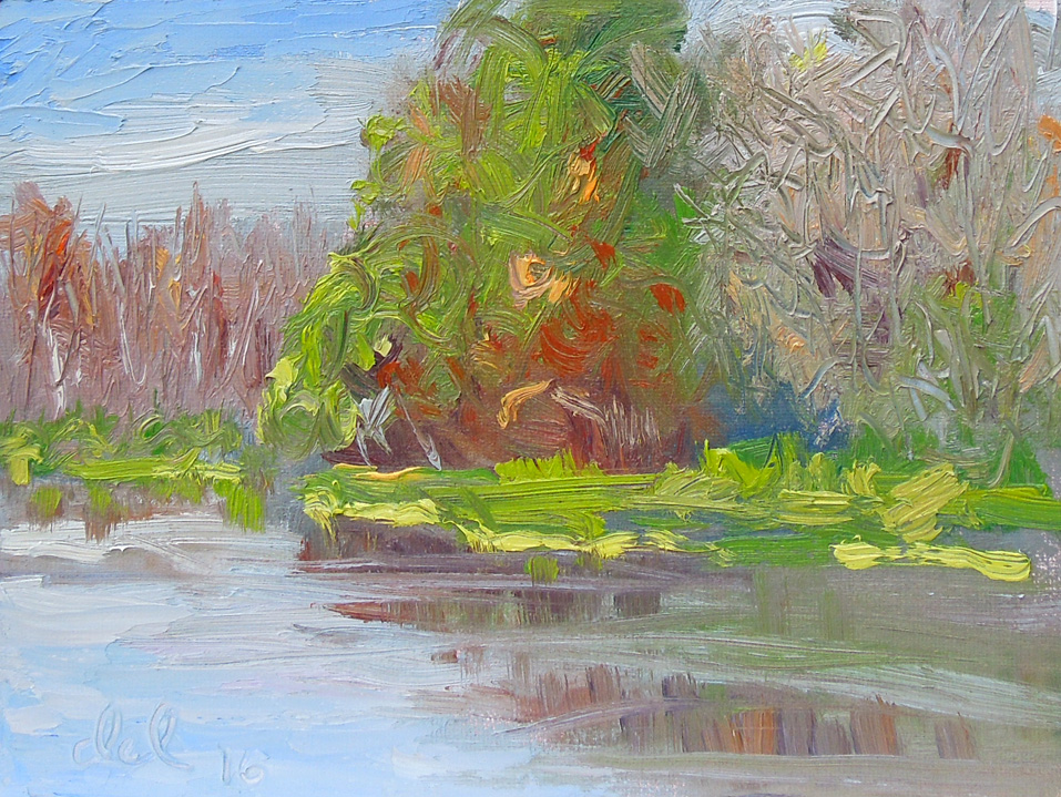
Because of copyright issues I haven’t included one of Sovek’s paintings here but strongly urge you to visit the website and look through his galleries as well as the “Lessons from the Easel”. He was a wonderful painter and teacher. You can get his books and dvd’s there also.
This website is also interesting, Sorolla’s paintings and biography:
http://www.joaquin-sorolla-y-bastida.org/