The Mokie Chronicles Day 10 – Lizards love to play hide and seek!
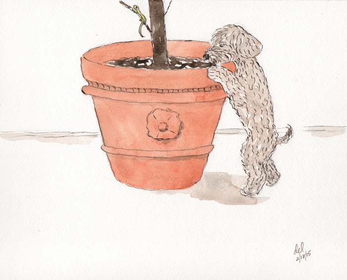
The Mokie Chronicles Day 10 – Lizards love to play hide and seek!
The Mokie Chronicles Day 9 – It is best to eat spaghetti standing up.

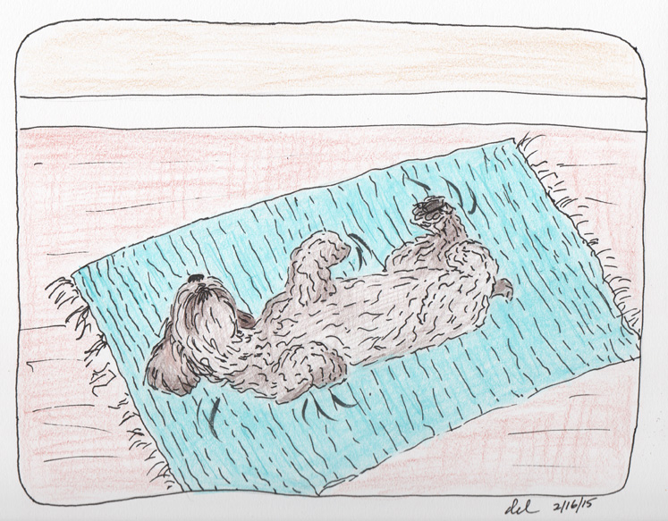
The Mokie Chronicles Day 8 – A daily conniption is a great stress reducer!
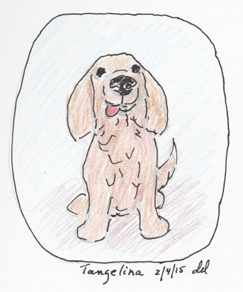
The Mokie Chronicles – Day 4 – This is my sister Tangelina. She loves me!
Day Three – Toys can be used to barter for high value goods!

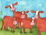
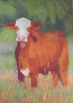
The Cow – Robert Lewis Stevenson, A Child’s Garden of Verses
The friendly cow all red and white,
I love with all my heart:
she gives me cream with all her might,
To eat with apple-tart.
She wanders lowing here and there,
And yet she cannot stray,
All in the pleasant open air,
The pleasant light of day;
And blown by all the winds that pass
And wet with all the showers,
She walks among the meadow grass
And eats the meadow flowers.


It’s rare to get free publicity, at least for me it is, but one of my paintings will be in the next issue, July/August, of Fine Art Connoisseur magazine. (not on newsstands yet) http://www.fineartconnoisseur.com/
The magazine is one of those well done, high quality, shiny art magazines that is aimed at collectors.
My painting is part of a photo essay on painting in parks, which is something I love to do. One of my favorite parks is a local one, Jonathan Dickinson State Park and the painting is one of several I’ve done of the Loxahatchee River. You’ve seen it here before, but here it is again:

You can see other paintings that are part of the Painting the Parks program on the Fine Art Gallery page.
Also here is the link to the website for Painting the Parks, so that you can see other park paintings. http://painttheparks.com/
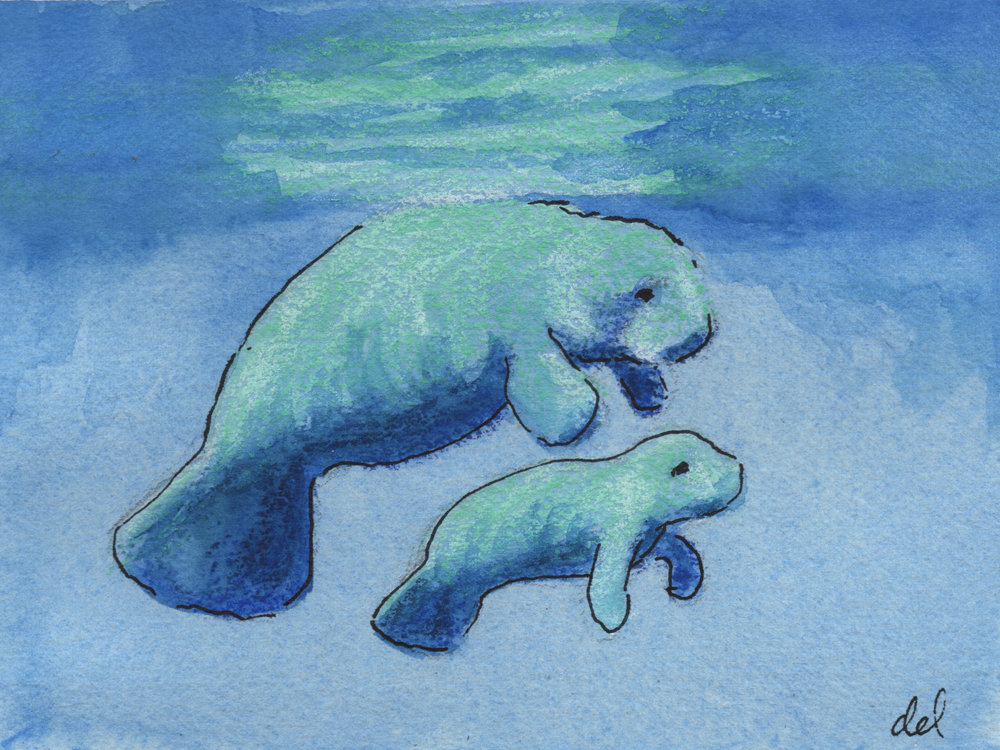
Inspired by a fellow blogger’s challenge to come up with something blue that says “spring”. http://decorartuk.wordpress.com/2014/03/22/something-in-common/ The local manatees came to mind right away. They are also known as sea cows and have a fairly bovine personality – sweet, slow and docile, not to mention big.
One time while walking near a dock I saw some manatees and one seemed to have a problem. After talking to a local officer they found that she had been playing this trick all along the coast and in fact she was fine, but seemed to like the attention. Silly cow.
Here’s a nice video, so you can see what they look like:
https://www.youtube.com/watch?v=p7txP9MOCqs
Some basic manatee facts:
http://www.savethemanatee.org/manfcts.htm
and then there’s this – were they the basis for the myth of mermaids? I think so!
Originally my plan was to write about Sorolla and his palettes, however while researching I found the definitive article written on Sorolla, his palettes and technique. The article was written in 1990 by Charles Sovek as a cover article for The Artists Magazine.
The article is here: http://www.sovek.com/publications/articles/sorolla/index.htm
Sorolla’s palettes were different for portraiture or outdoor landscape, as stated in the article:
“Varying with the subjects he painted, Sorolla used essentially two different color palettes. For studio portraits, he favored one that included black, burnt umber, raw umber, rose madder, burnt sienna, raw sienna, yellow ochre, Naples yellow, vermilion and cobalt blue. Occasionally he would add orange, pink or purple, but he usually emphasized strong tonal contrasts over ambitious color effects. His outdoor palette was completely different and included cobalt violet, rose madder, all the cadmium reds, cadmium orange, all the cadmium yellows, yellow ochre, chrome green (since replaced by permanent green light), viridian, Prussian blue, cobalt blue and French ultramarine. In both cases, he used lead white.”
Unfortunately Charles Sovek passed away in 2007, however his website remains and is loaded with valuable information and is maintained by The Charles Sovek Estate.
http://www.sovek.com/index.htm
On the top of his section “Speaking of Art” he talks about the palette based on the color wheel, or a rainbow palette, which is similar to what I use, sometimes less and sometimes more, depending on what I’m painting, but a good color wheel palette in any medium keeps your paintings bright and less muddled.
Sovek’s suggestion is: Dioxine purple, permanent rose, cadmium red light, cadmium orange, cadmium yellow medium, cadmium yellow light, thalo green, cerulean blue, ultramarine blue, white, black.
Personally, most of the time I don’t use the purple, thalo green, cerulean blue or black and try to mix those instead. Sometimes I’ll use thalo blue (carefully – it’s a strong color). Also I use Veridian. But basically it does stay fresh and is a rainbow palette.
In the past I’ve discussed palettes for pastels and do in fact use different palettes for portraits and landscapes, more earthtones for the portraits and more of a color wheel selection for landscapes.
Because of copyright issues I haven’t included one of Sovek’s paintings here but strongly urge you to visit the website and look through his galleries as well as the “Lessons from the Easel”. He was a wonderful painter and teacher. You can get his books and dvd’s there also.
This website is also interesting, Sorolla’s paintings and biography:
http://www.joaquin-sorolla-y-bastida.org/
Literary Agent
Barbies on Fire
Just another WordPress.com site
educational publishing specialist, author, editor, seeker of rabbit holes
Novelist of Literary Fiction
Just because you CAN read Moby Dick doesn't mean you should!
A meeting place for a world of reflective writers.
Julie Abery
